1.1
Weight system
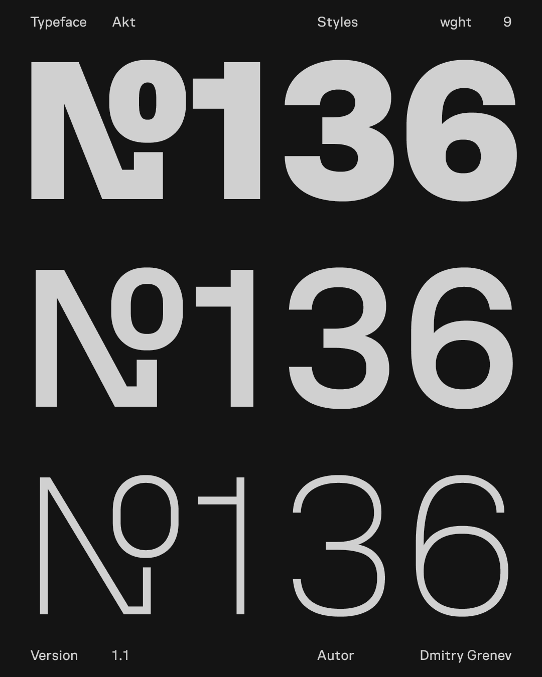
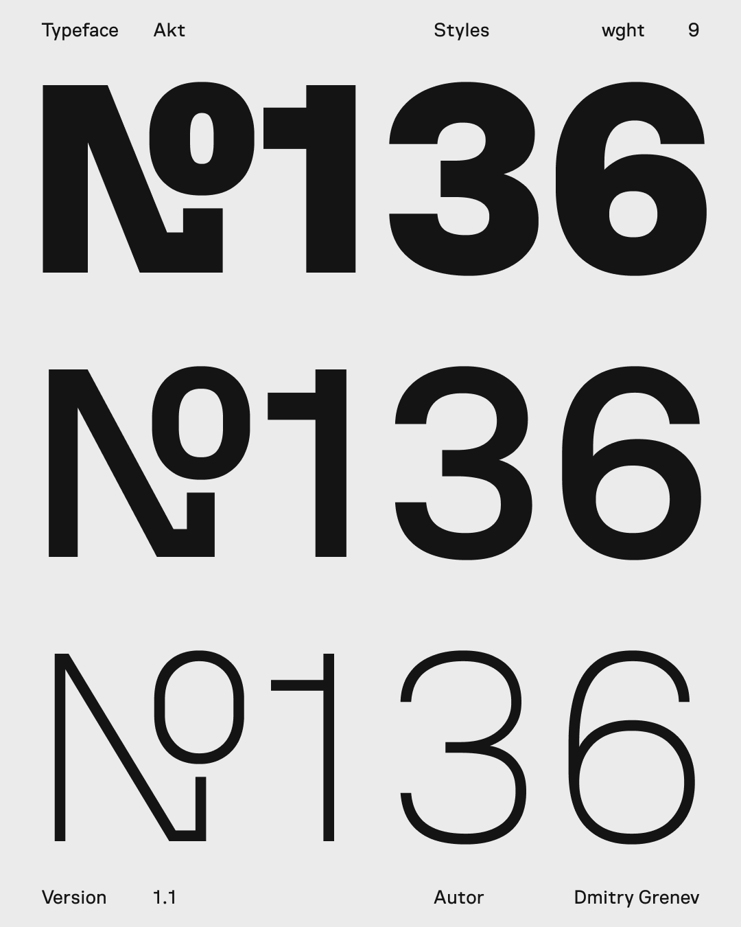
Nine weights cover the range from quiet service text to strong headings while staying inside one typographic system.
Akt is a contemporary sans-serif typeface crafted for clarity and precision in modern digital design. Built with an interface-first approach, it ensures consistent behavior across layouts, components, and viewports — a dependable foundation for UI and design systems.
Each weight is designed with intent: mid-range weights support comfortable reading, while heavier ones add focus and structure to titles and key visual elements. Balancing rational geometry with refined optical details, Akt offers the precision developers need and the flexibility designers expect — a unified typographic system for modern interfaces and branding.
The variable font axis allows fine-tuning weight to match your layout needs. The family covers basic Latin and Cyrillic scripts and includes essential punctuation and symbols. Vertical metrics are set for balanced line spacing across platforms.
Design highlights include compact counters, open apertures, and a steady rhythm that works well from small UI labels to longer paragraphs. The typographic color remains consistent through the optical weight range, making it reliable for product design, dashboards, and editorial interfaces.
This section shows the structural base of Akt: the weight range, display behavior, scripts, figures, symbols, arrows, and OpenType forms.
Nine weights cover the range from quiet service text to strong headings while staying inside one typographic system.
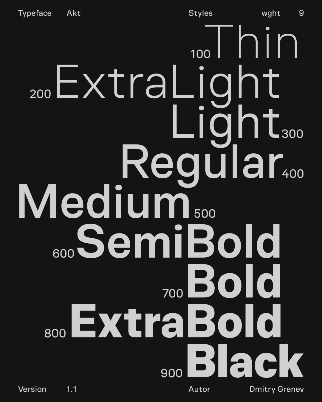
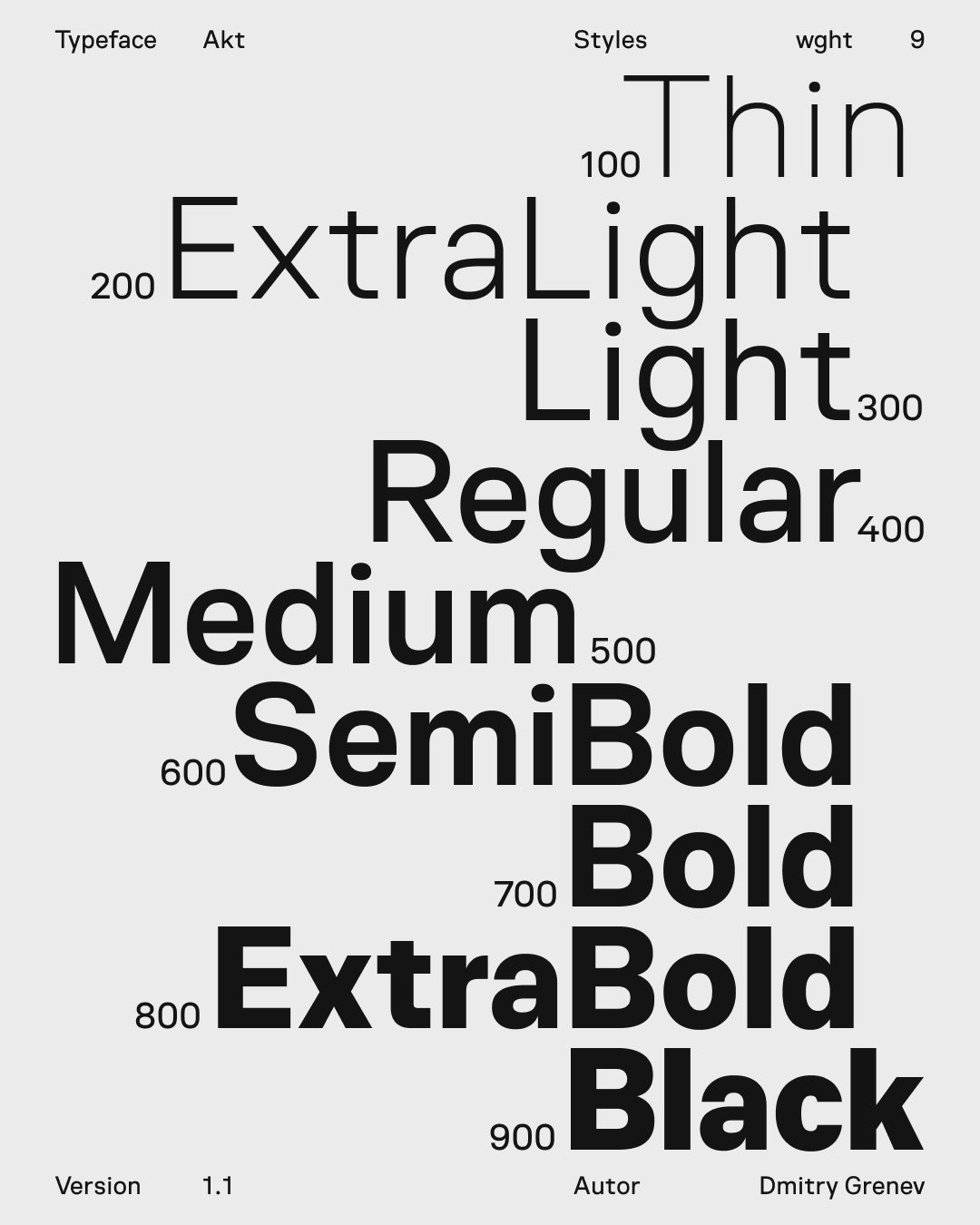
Large-size setting shows the display range of the family without breaking spacing or rhythm.
The glyph set supports Extended Latin, Extended Cyrillic, Greek, and basic IPA, plus figures, symbols, arrows, and OpenType forms.
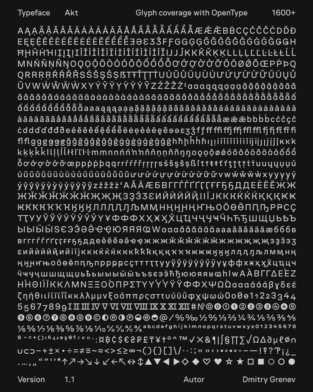
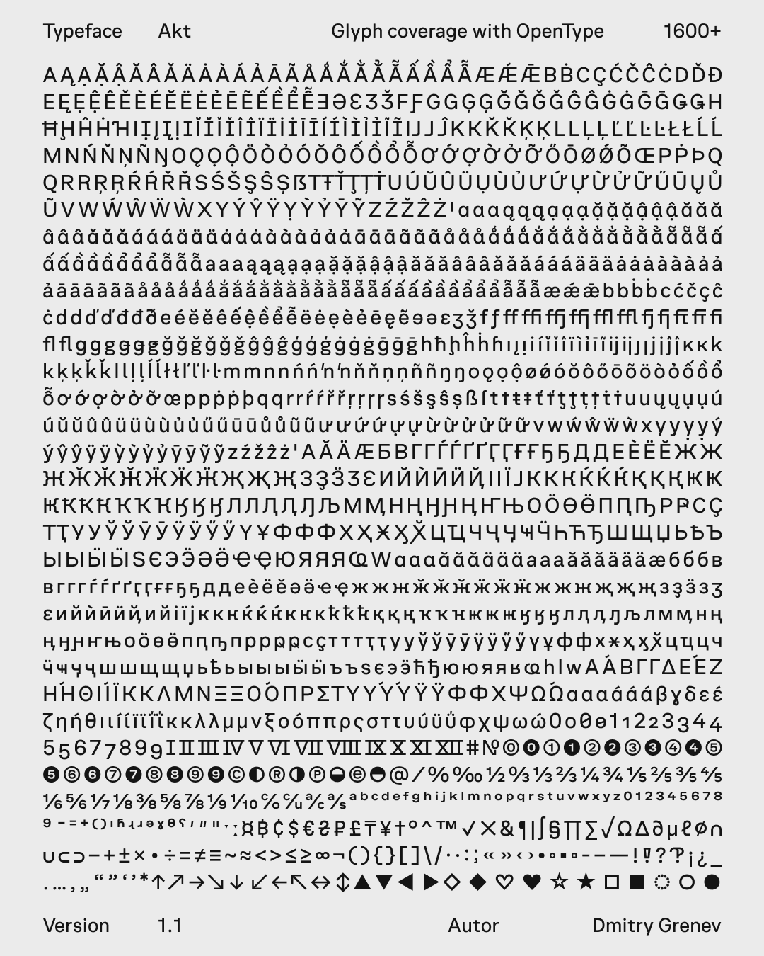
The feature blocks explain how the family behaves in interface conditions: weight calibration, unispaced widths, icon alignment, dark themes, and stylistic sets.
Curves and terminals are calibrated so the character of the letterforms remains stable as the weight changes.
Unispacing helps keep line length and component dimensions predictable when weight changes.
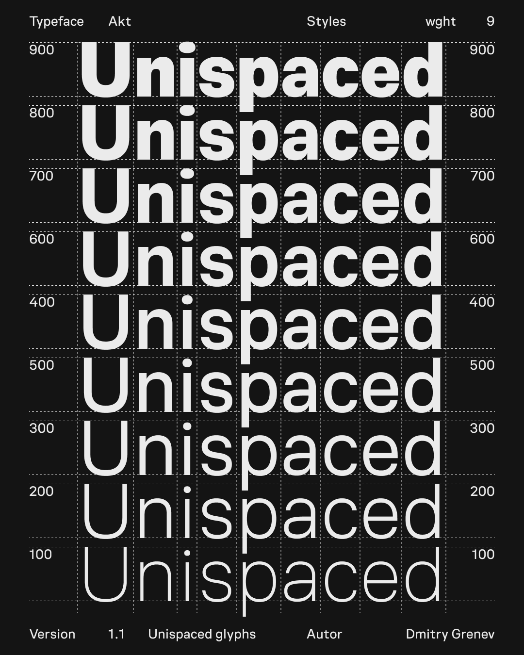
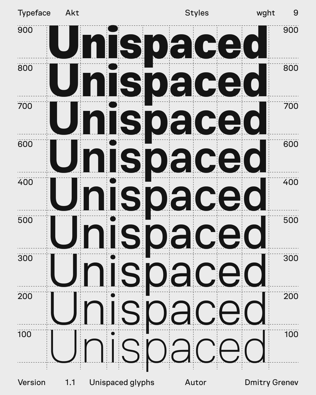
Capitals are centered within the line height so labels sit cleanly next to icons and controls.
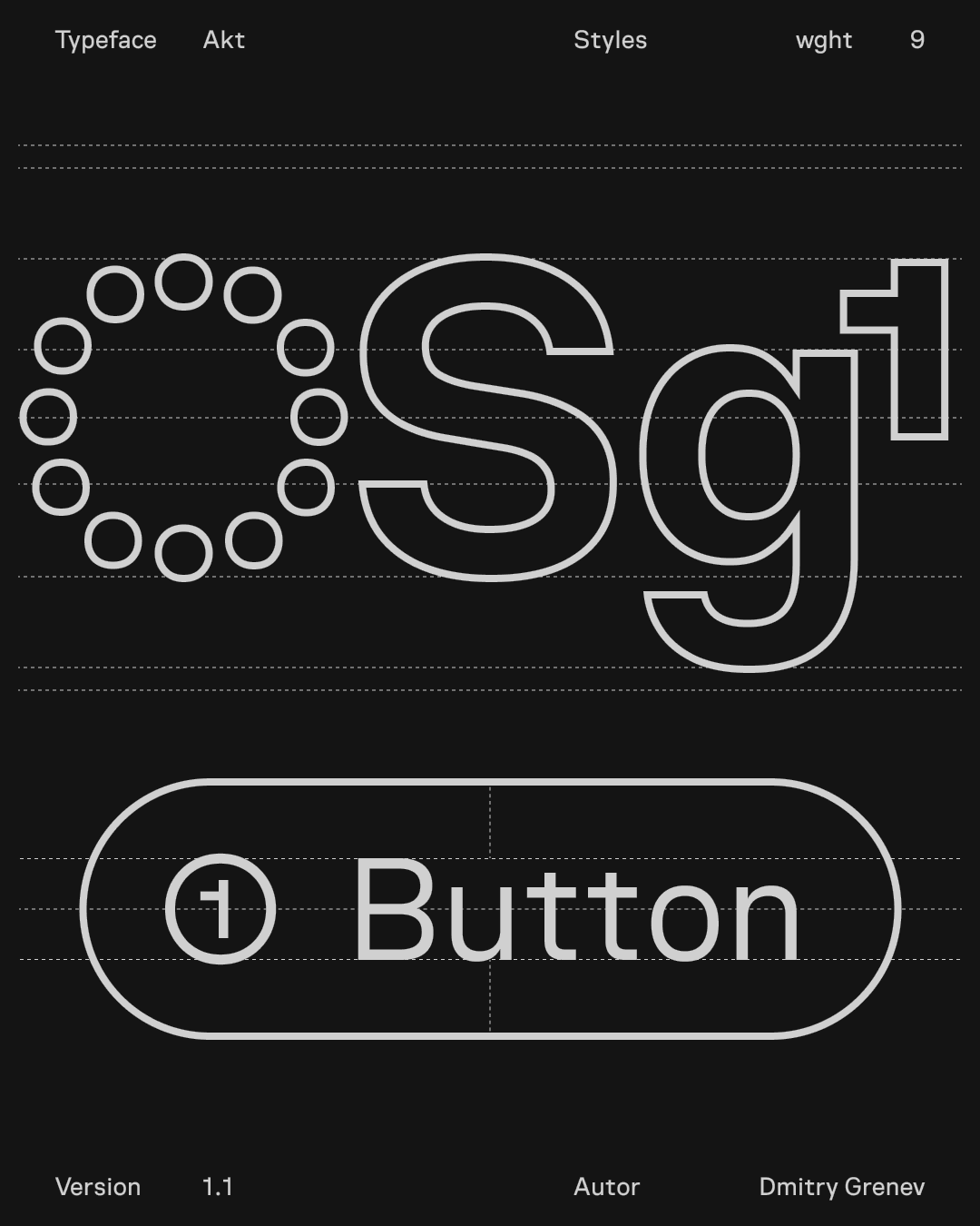
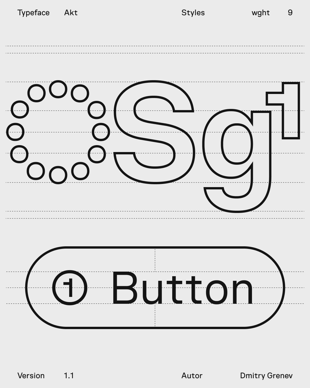
In dark themes, a one-step lighter weight preserves contrast, rhythm, and perceived density.
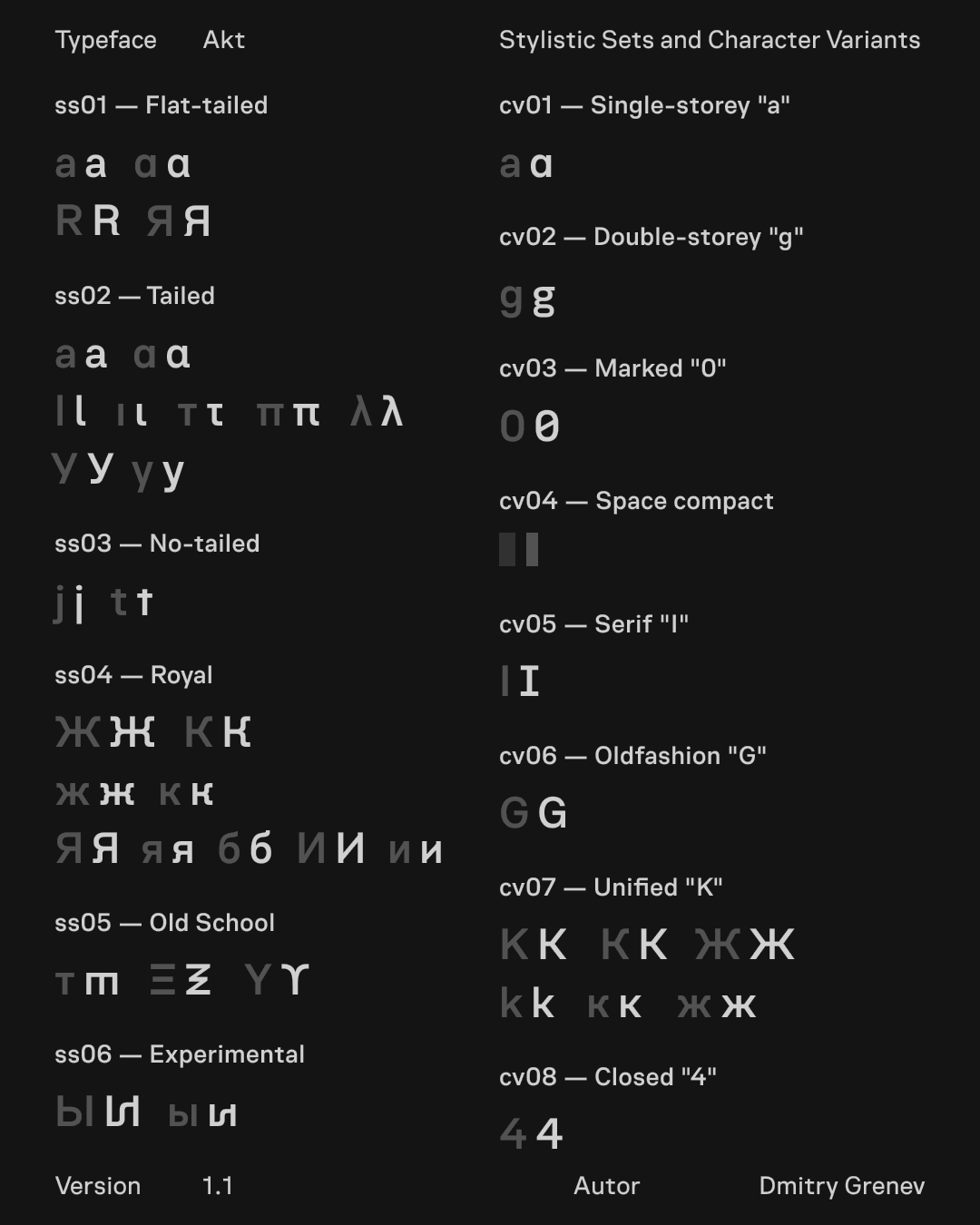
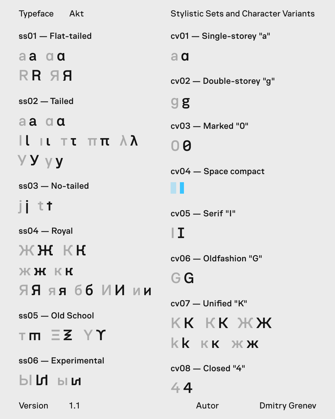
Stylistic sets add controlled variants for interface-oriented letterforms, Cyrillic alternates, old-style figures, and experimental characters.
Samples check how the typeface holds numeric data and longer reading text beyond isolated glyph sheets.
Numerals are drawn for metrics, statuses, indices, and tabular values, with clear distinction across weights.
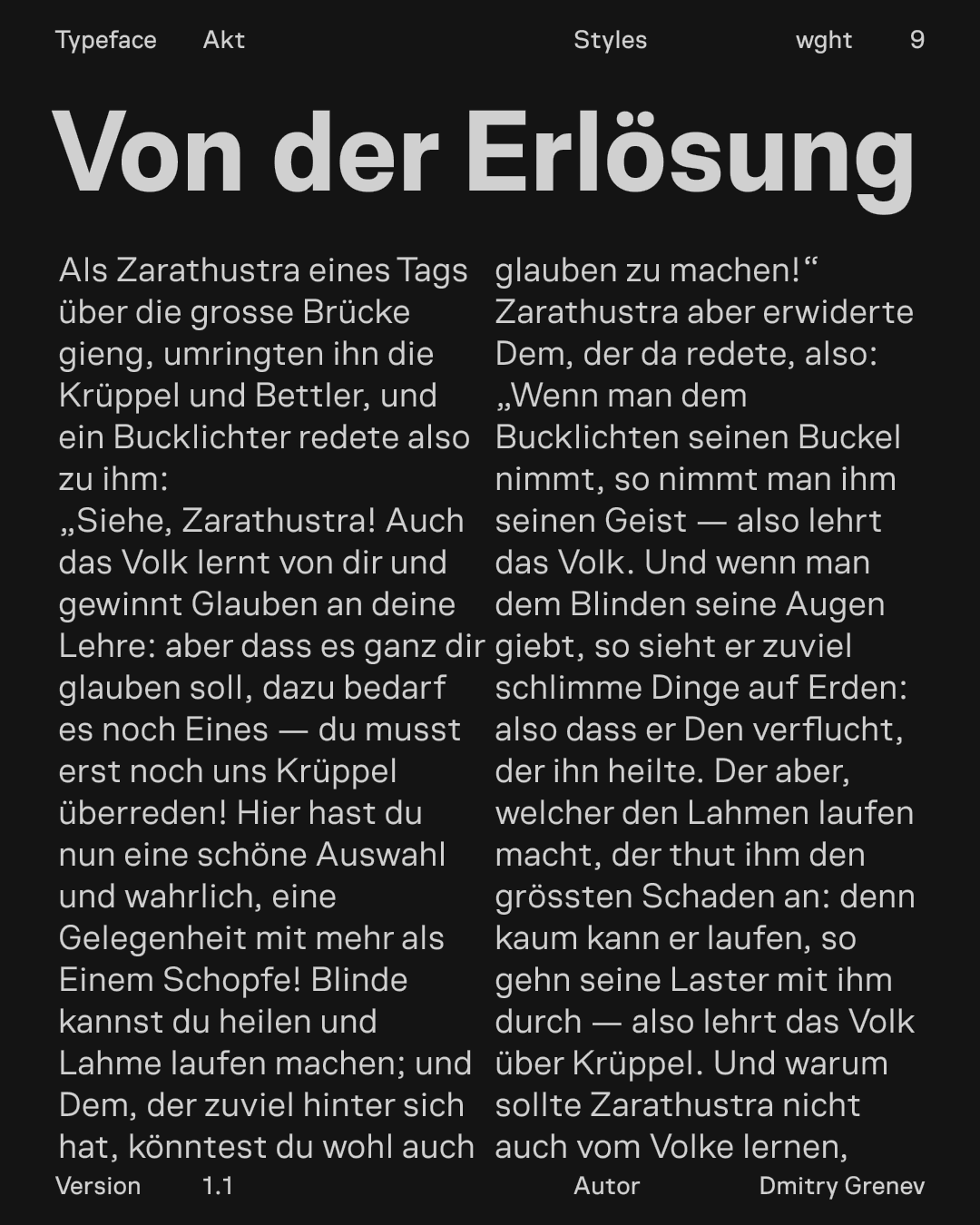
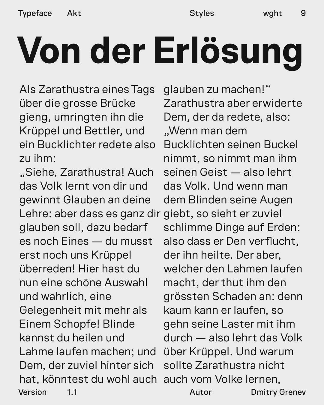
Paragraph-scale setting tests density, line rhythm, and reading stability beyond short labels and headings.